1.0.00Problem
1.0.00Problem
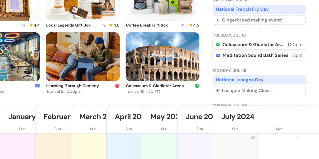
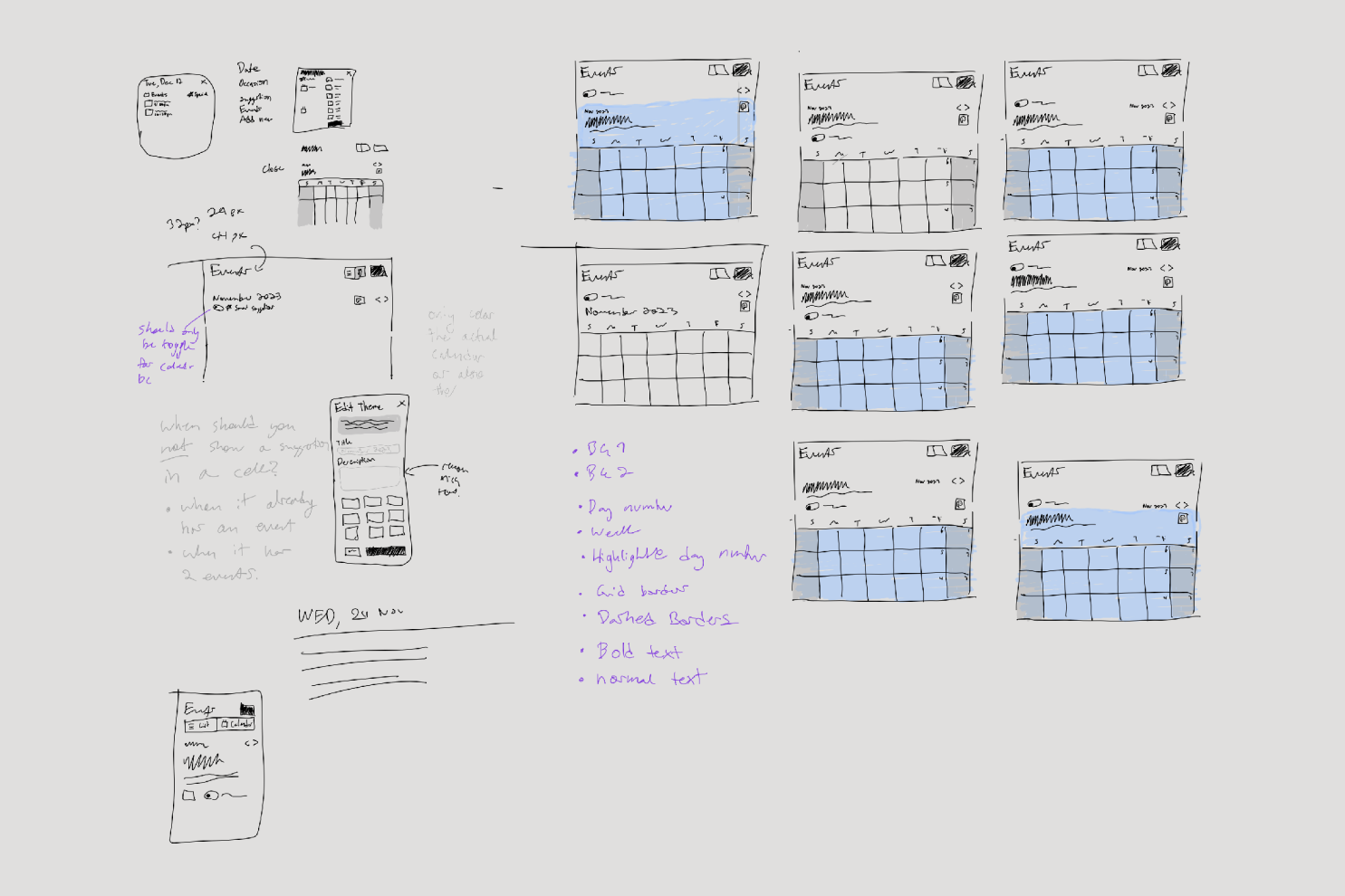
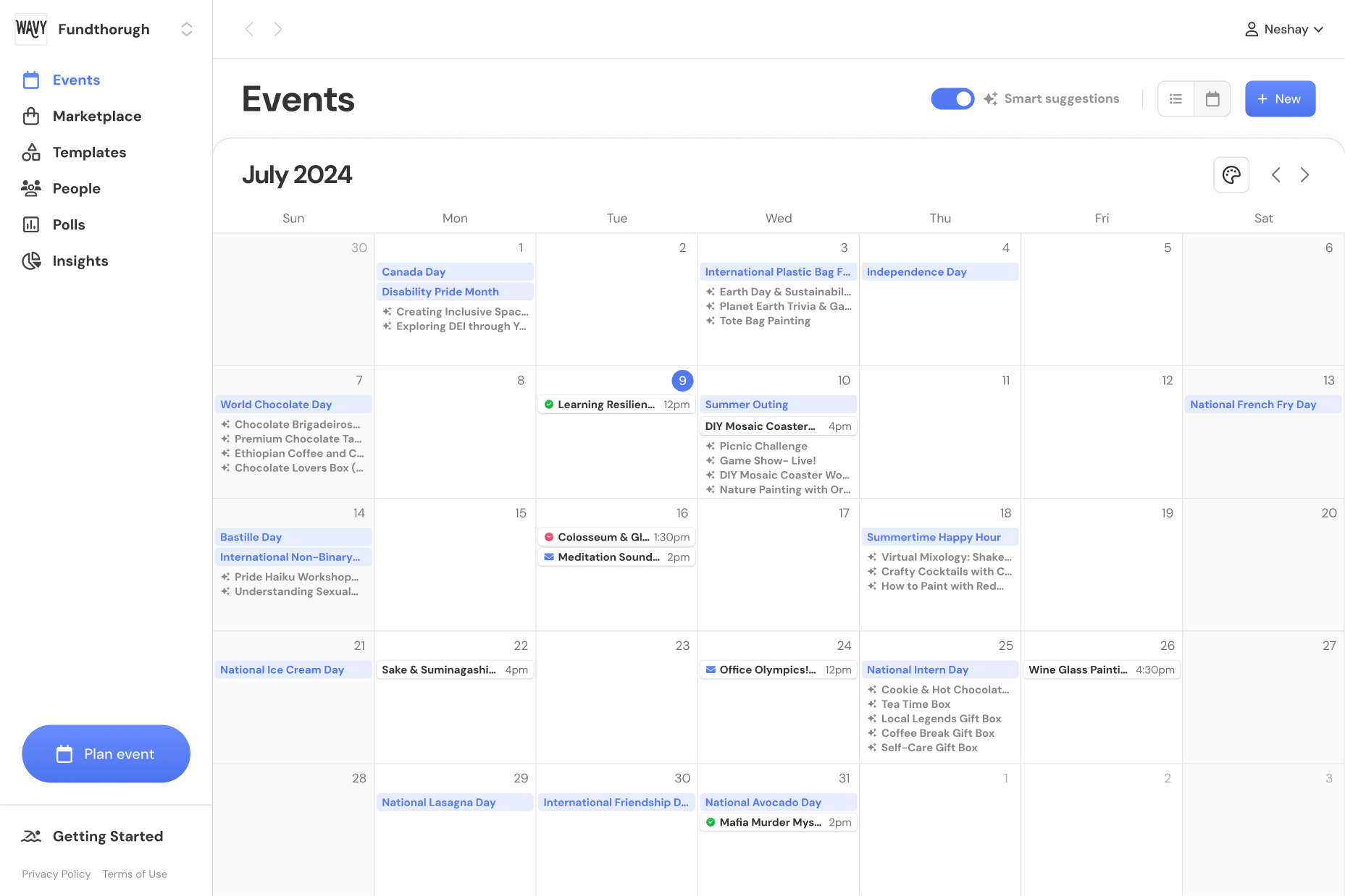
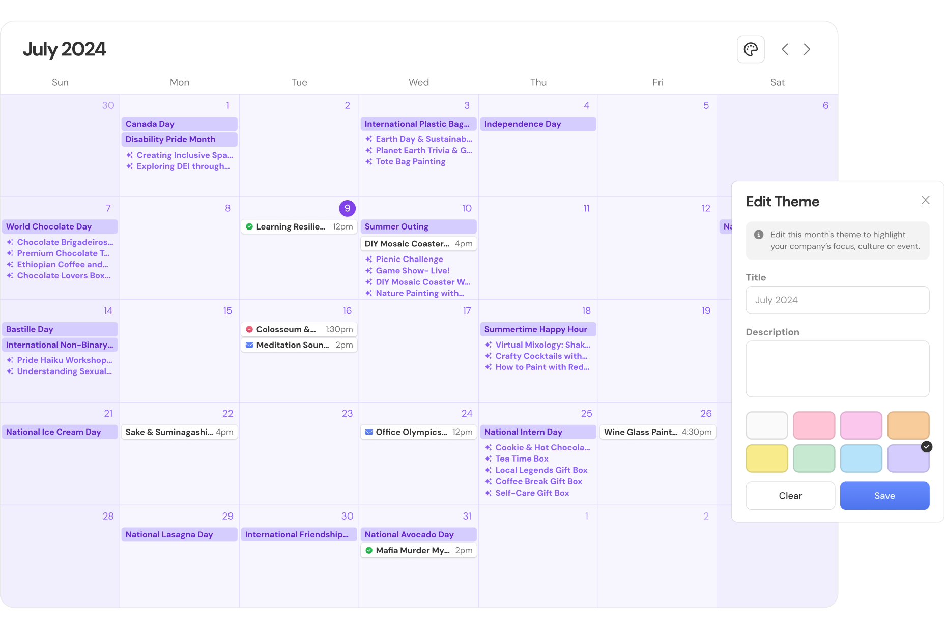
Wavy’s homepage featured a single calendar view showing events, notable days and suggestions. The issue was that it was hard to find events you cared about.
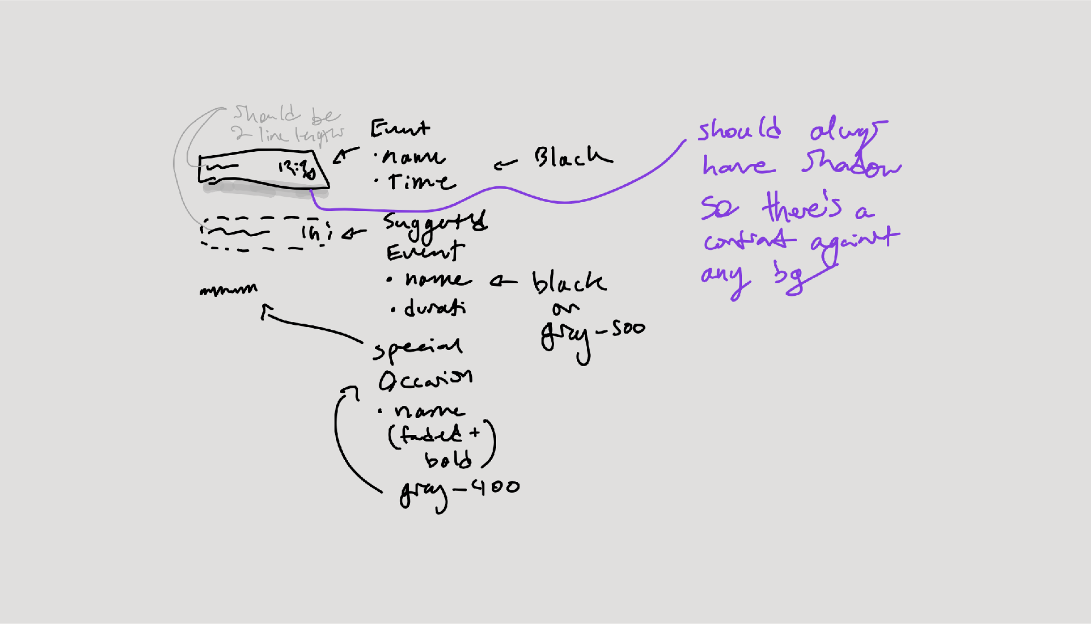
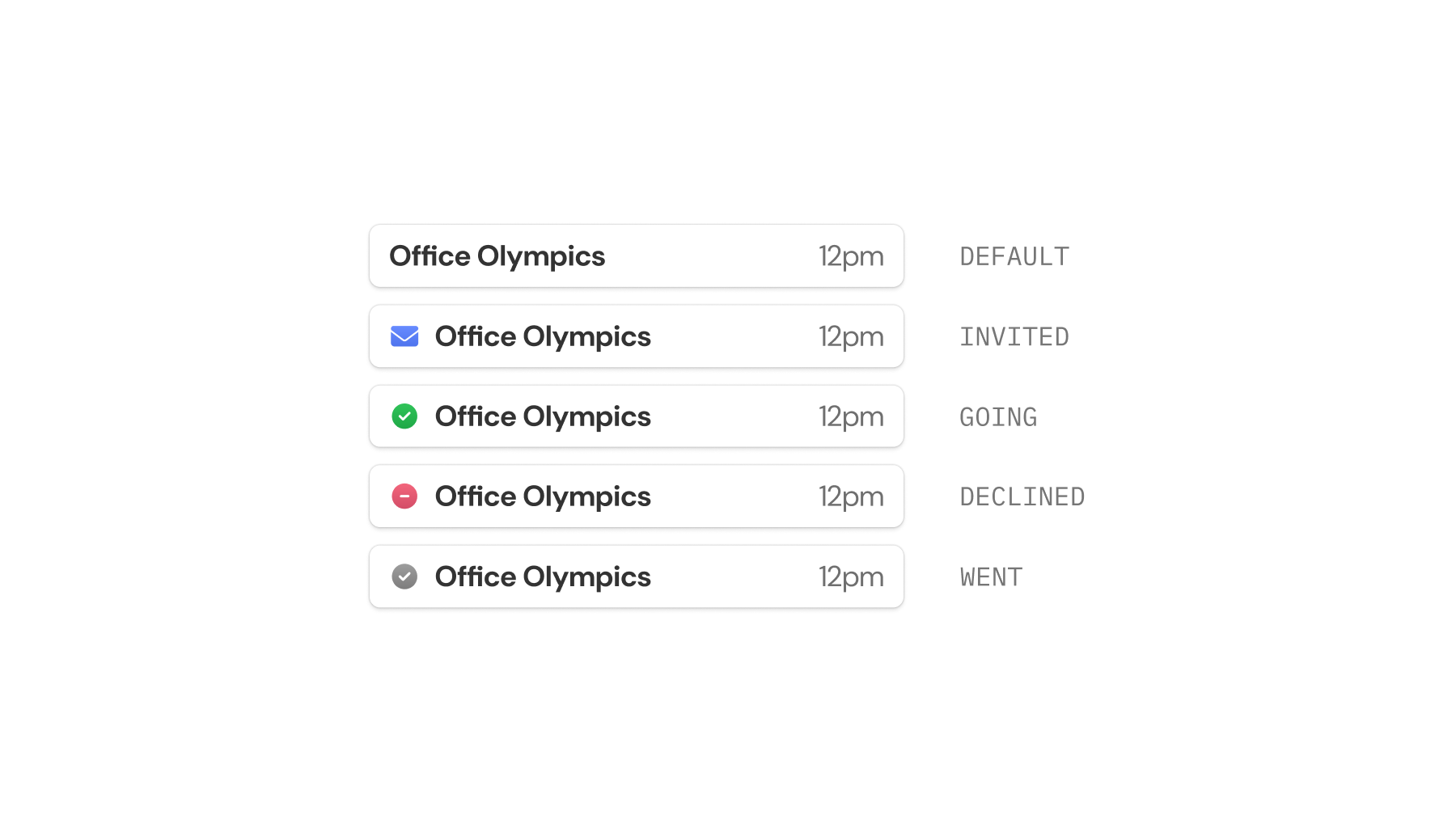
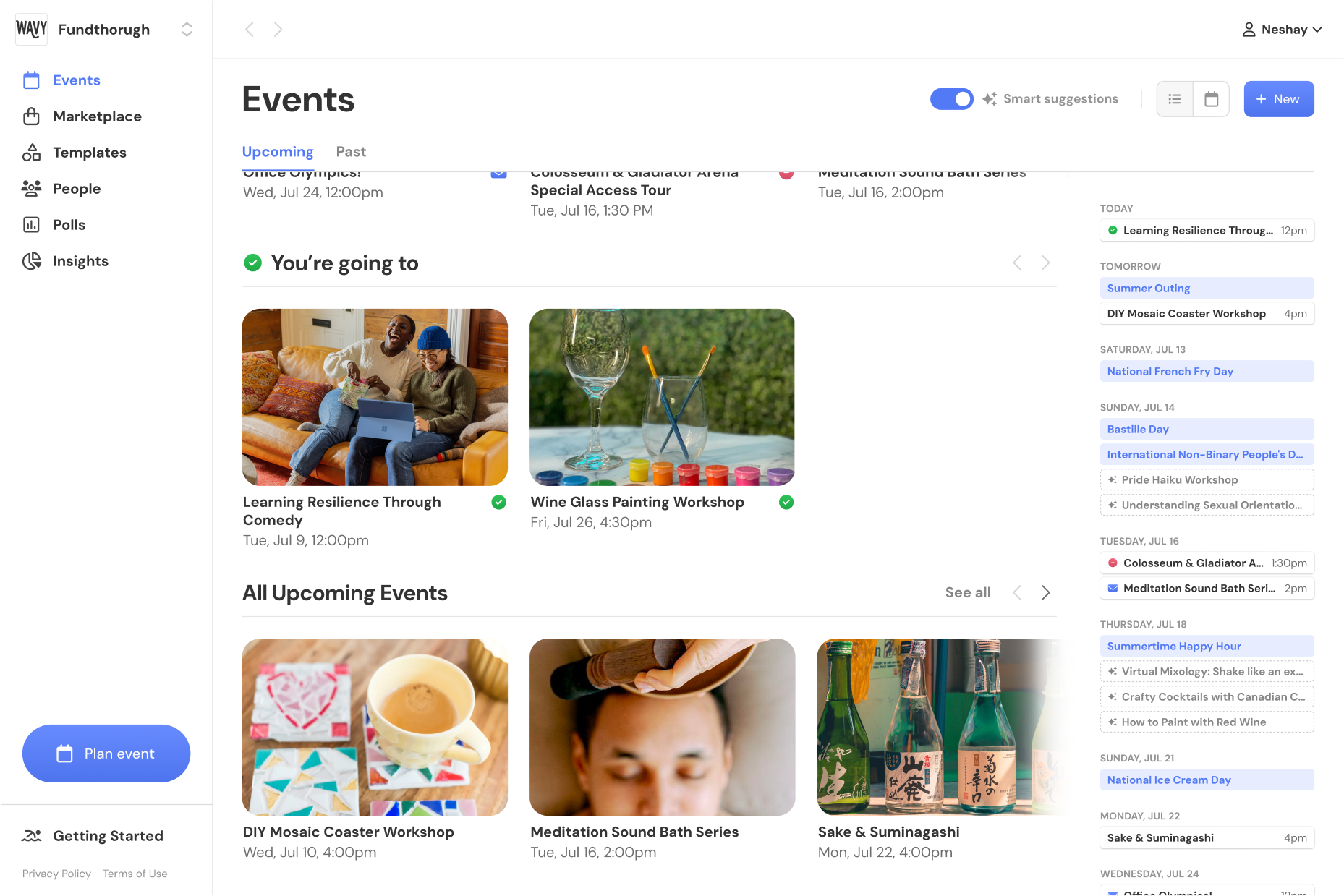
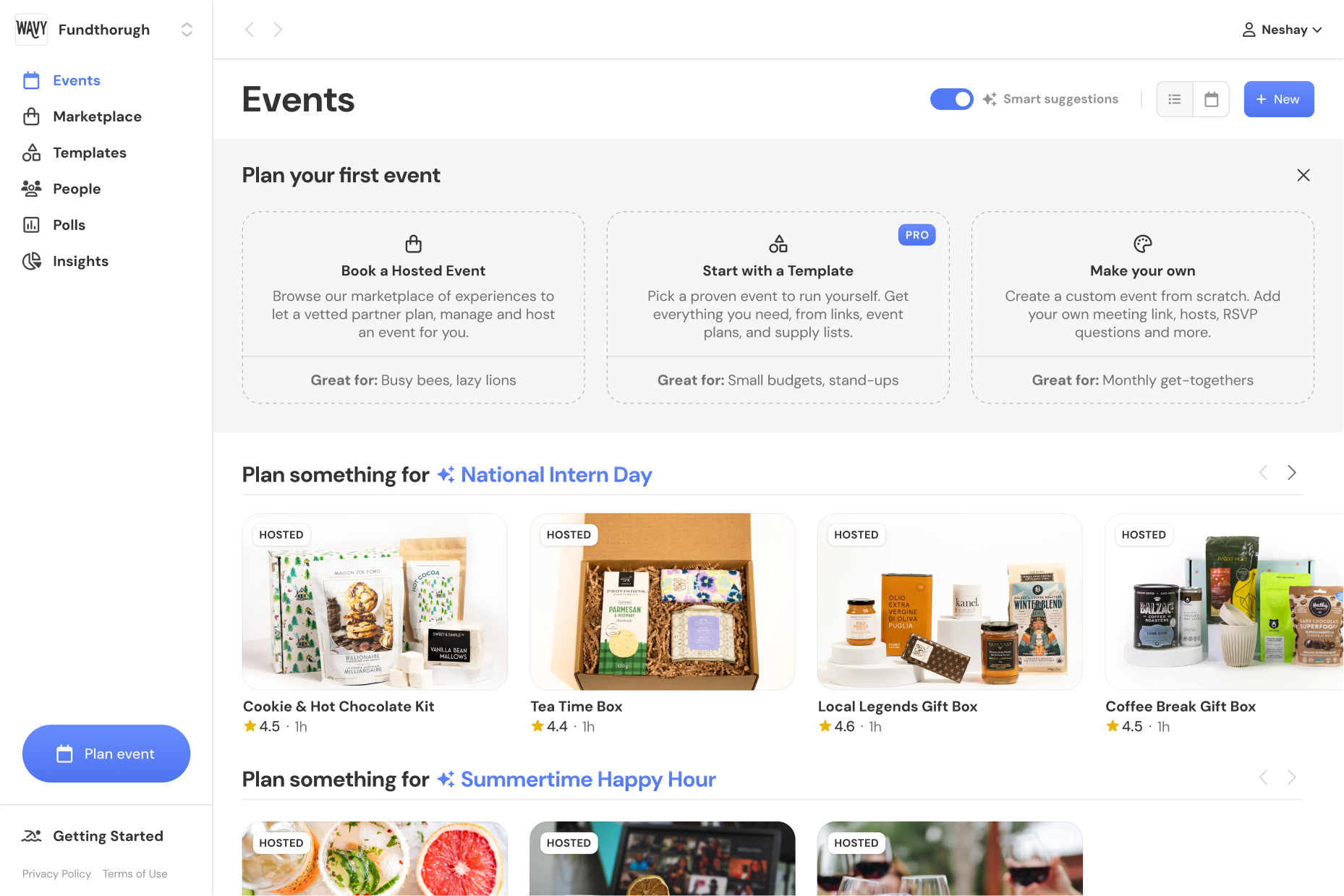
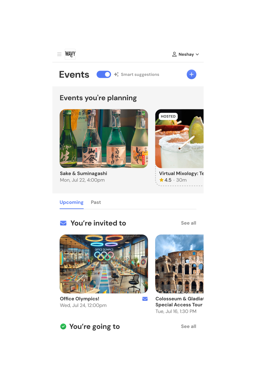
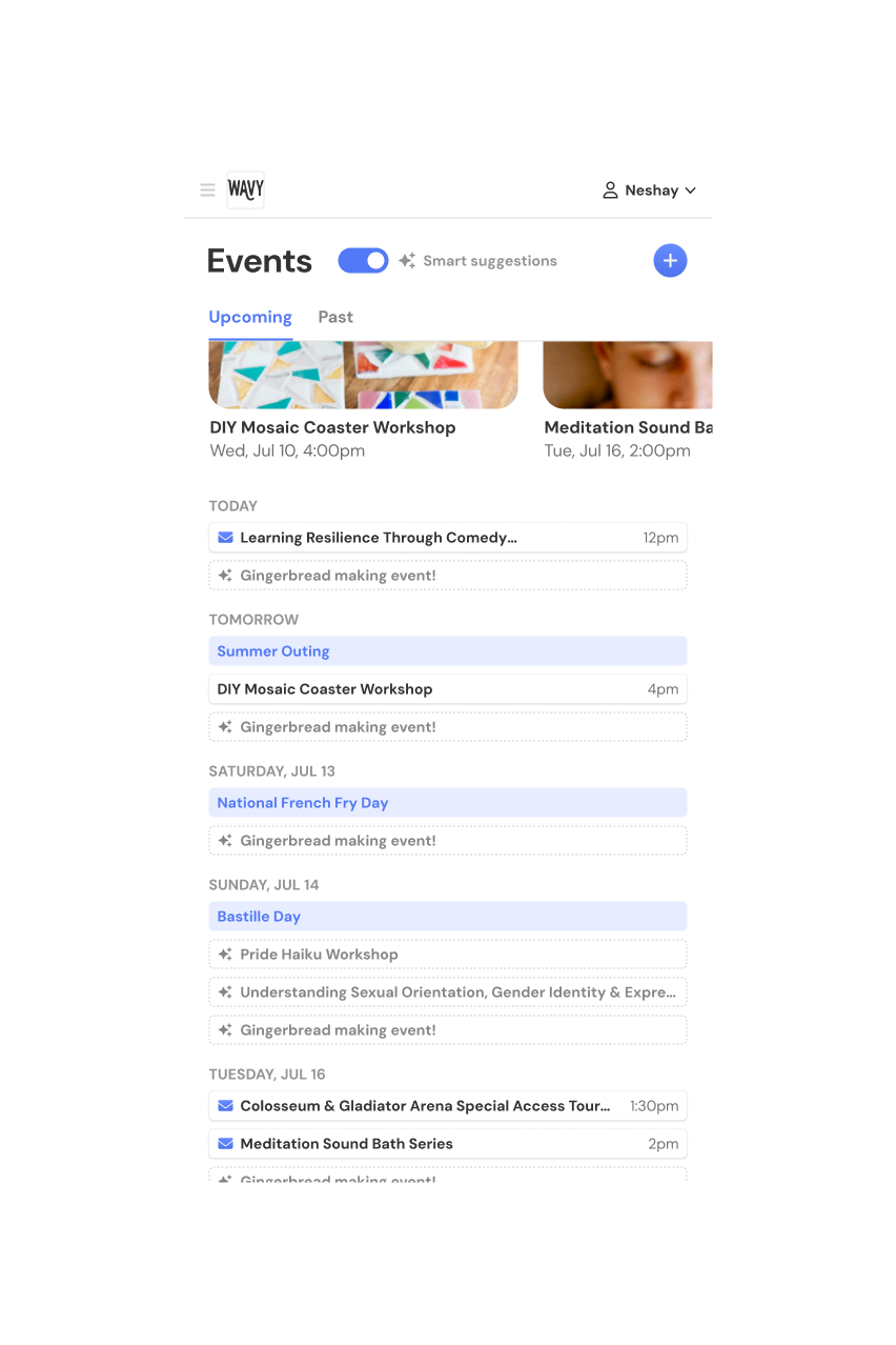
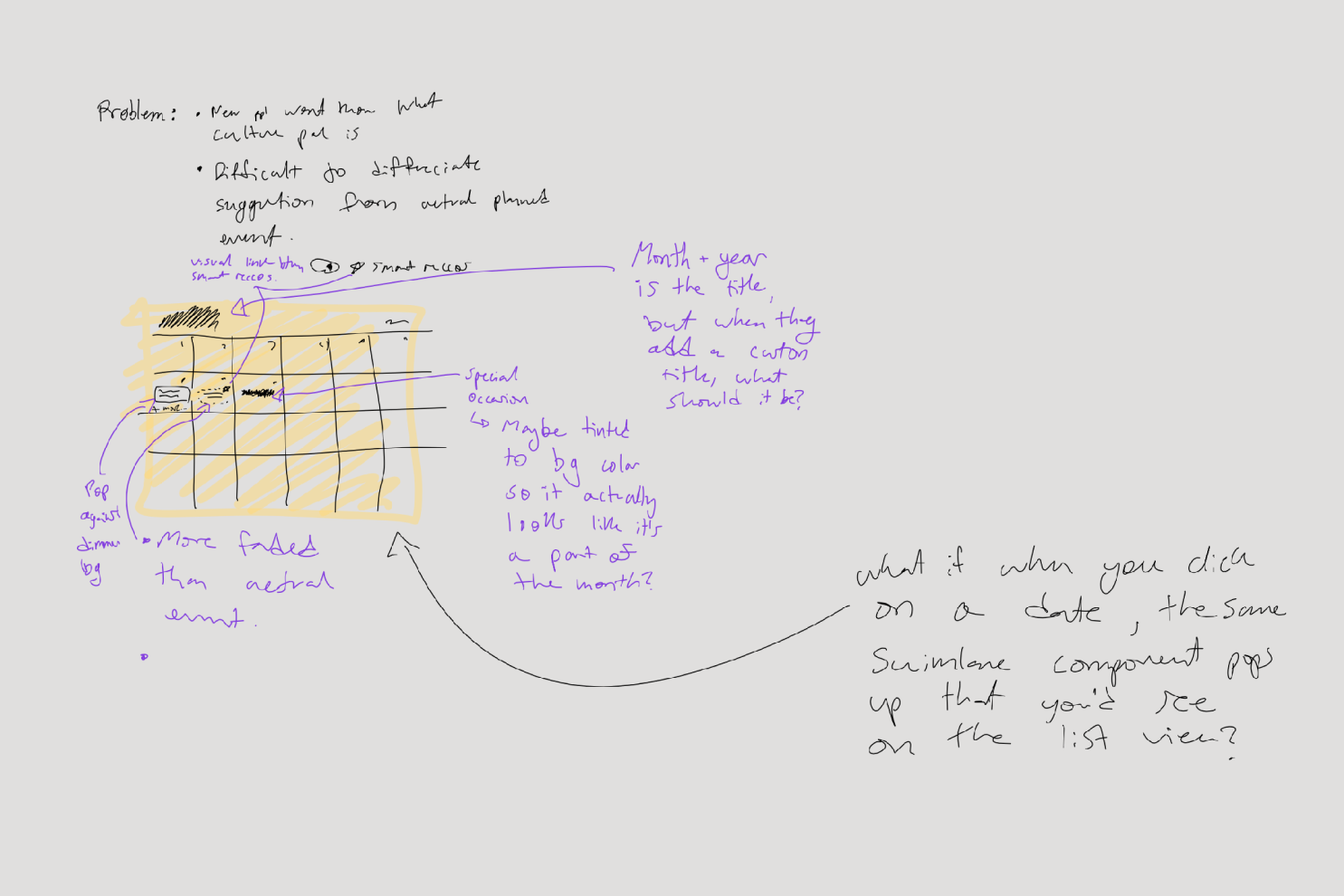
- Items were undifferentiated, making it hard to discern events from suggestions or find invites & RSVPs.
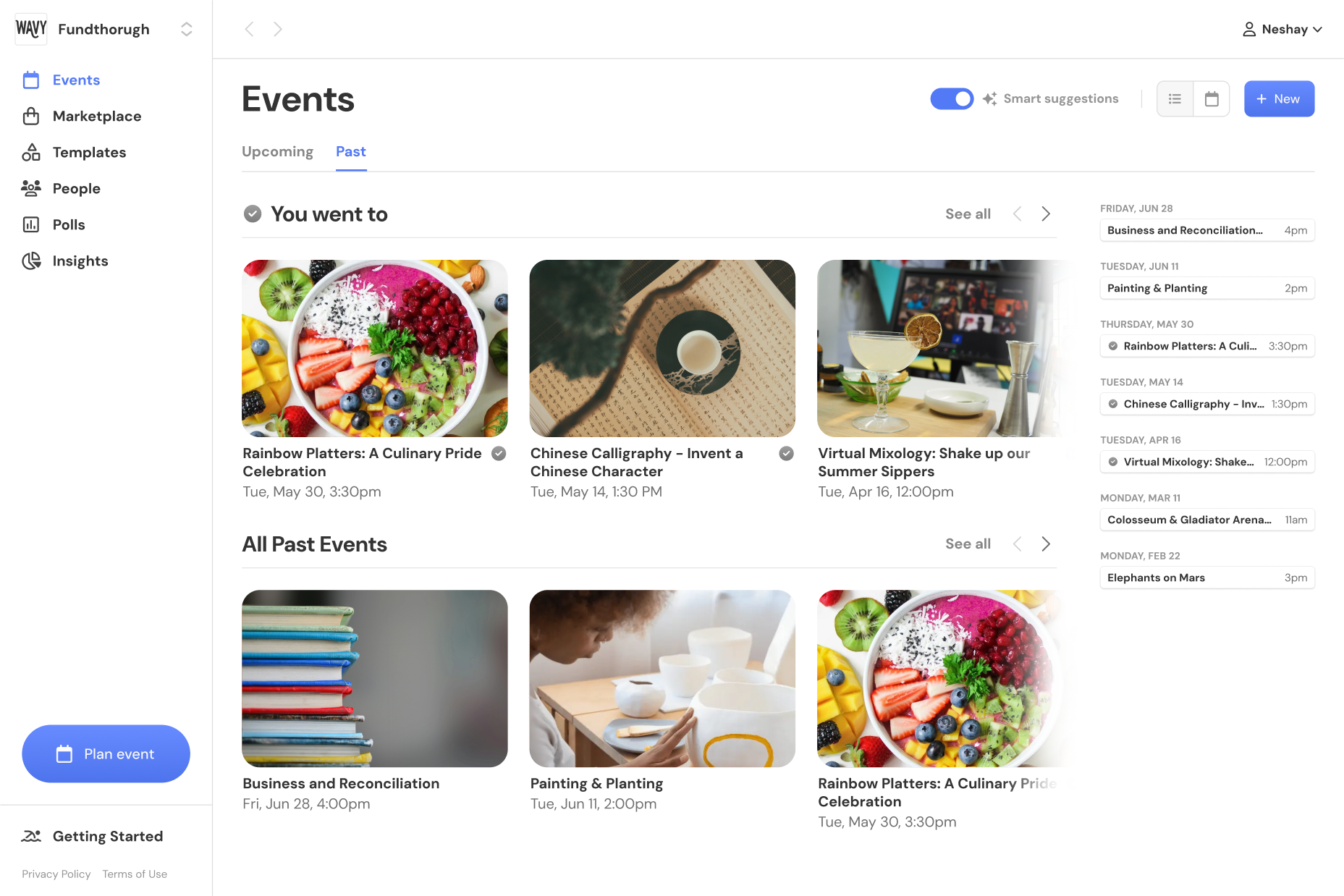
- Only showed one month at a time, making it hard to find future & past events.
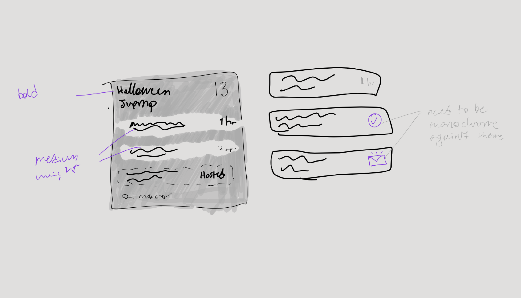
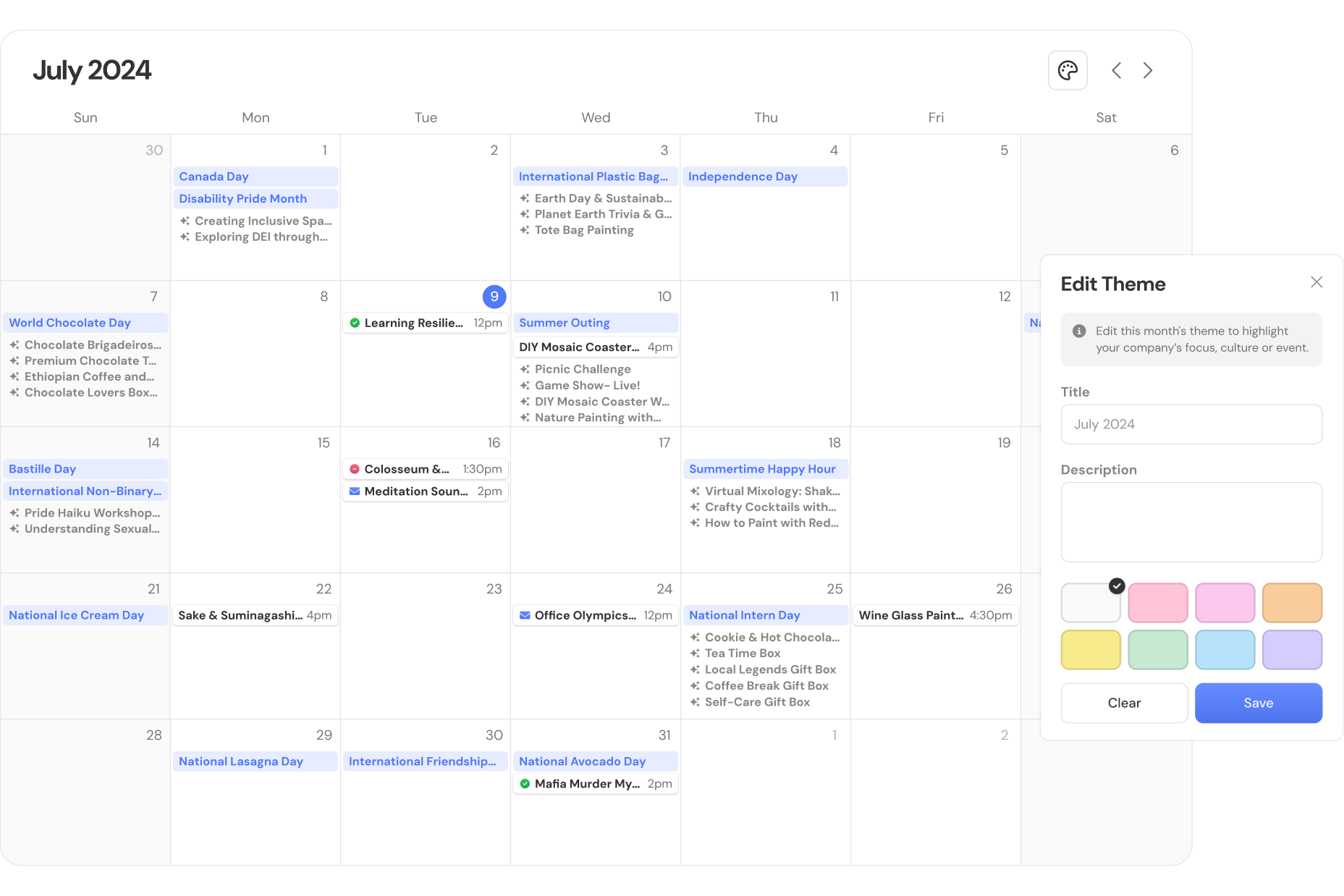
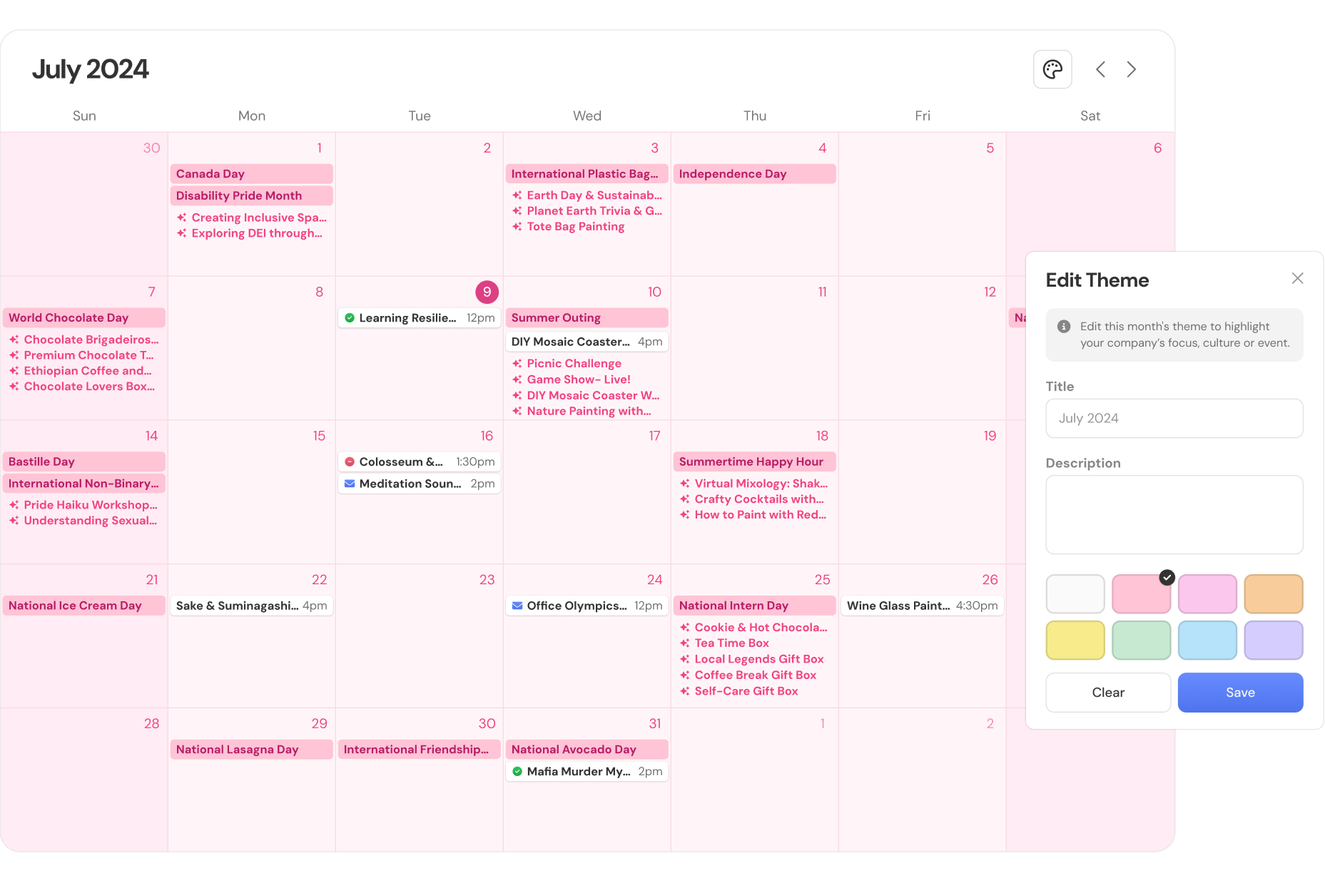
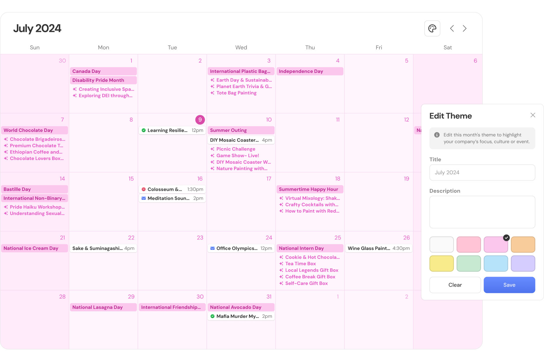
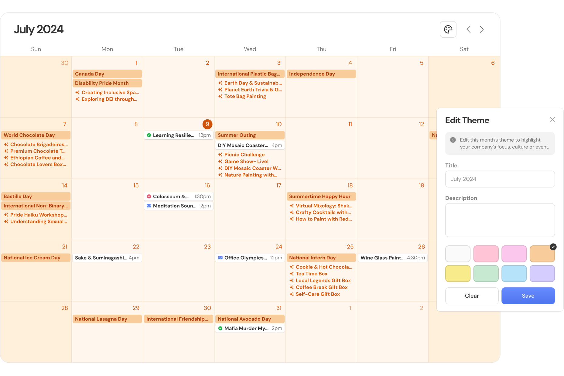
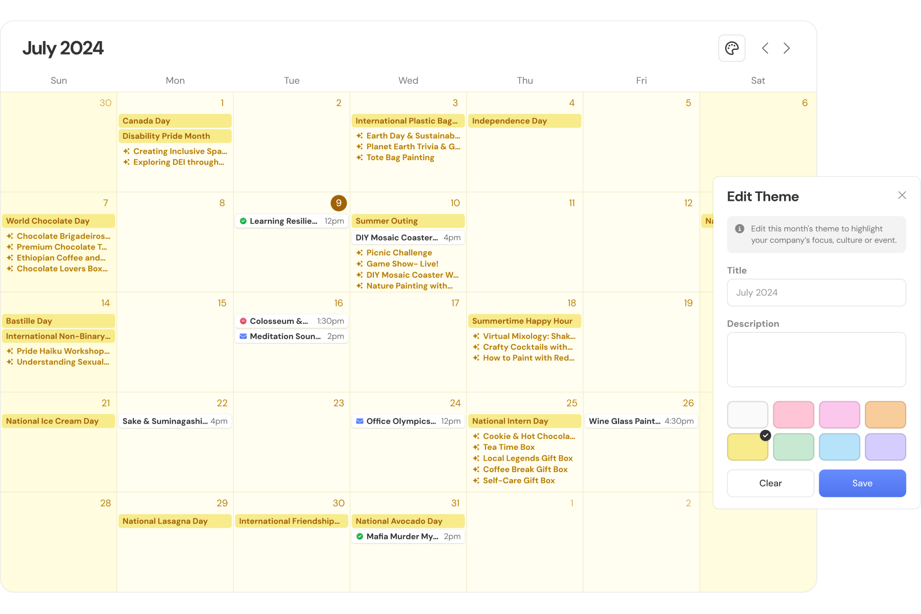
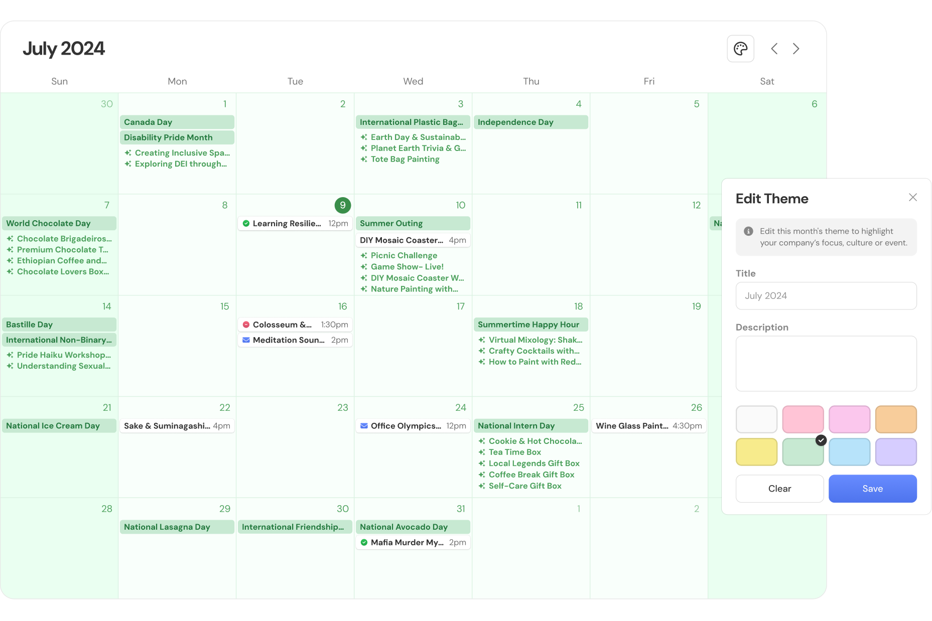
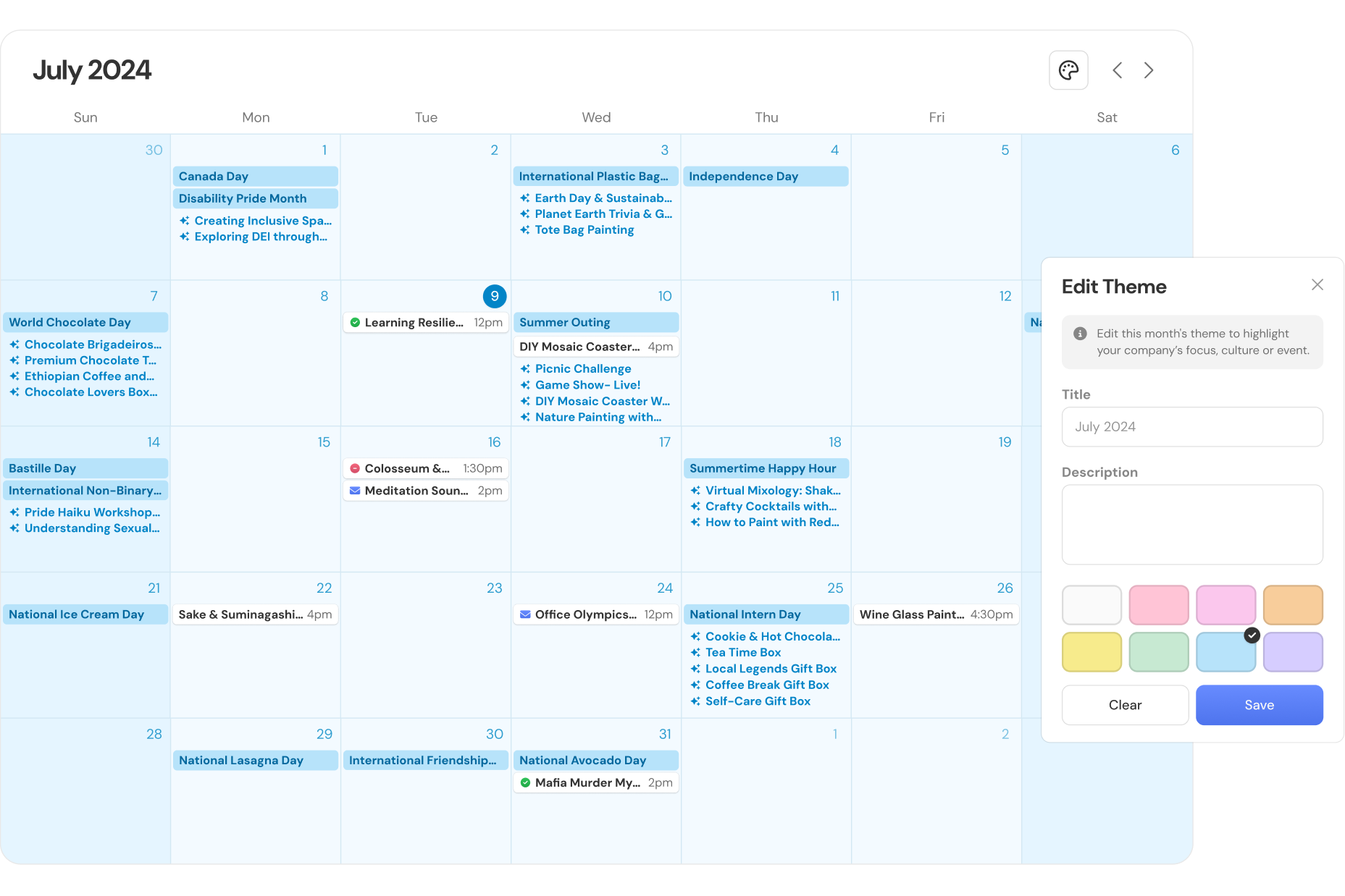
- Calendar themes used harsh, inaccessible colors, making text hard to read.
2.0.00Task
2.0.00Task
2.1.00Goal
Make UI navigable and parsable. Resolve issues with information architecture, calendar visibility and visual clarity to help people navigate Wavy while reinforcing its brand.
2.2.00Role
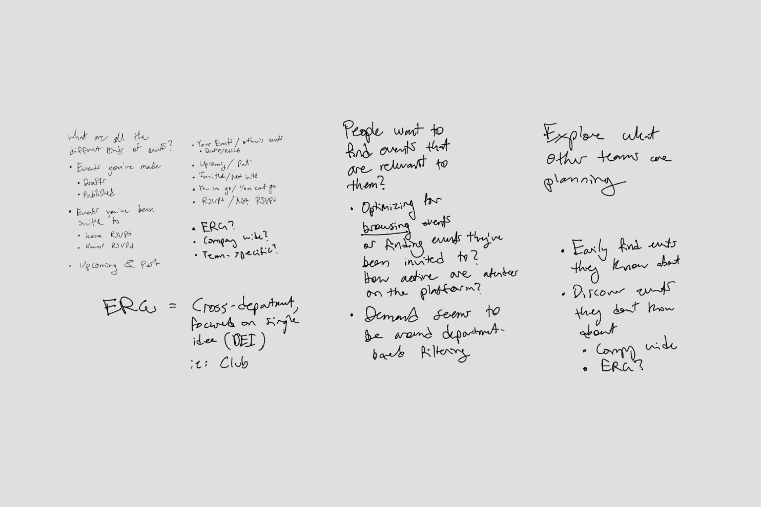
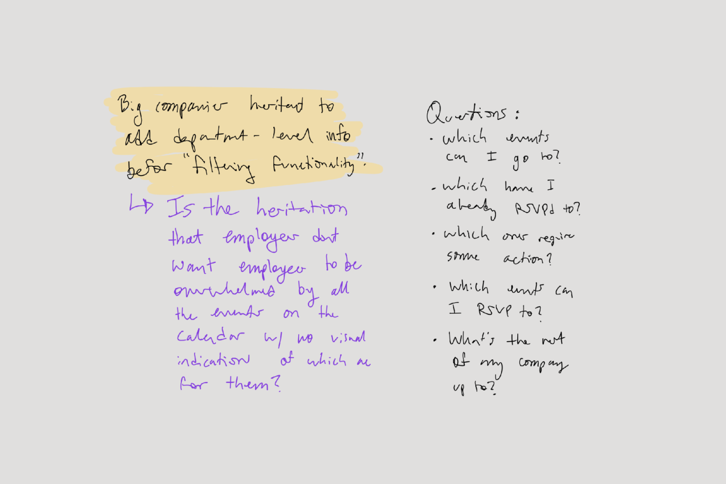
Led design. Researched needs, reorganized information architecture, managed project scope. Collaborated with the product team to get feedback and minimize work for a lean engineering team.
3.0.00Solution
3.0.00Solution
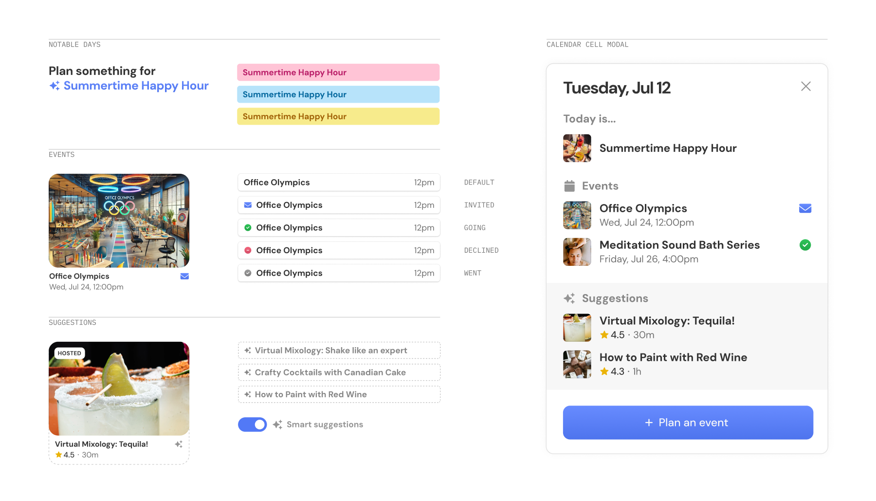
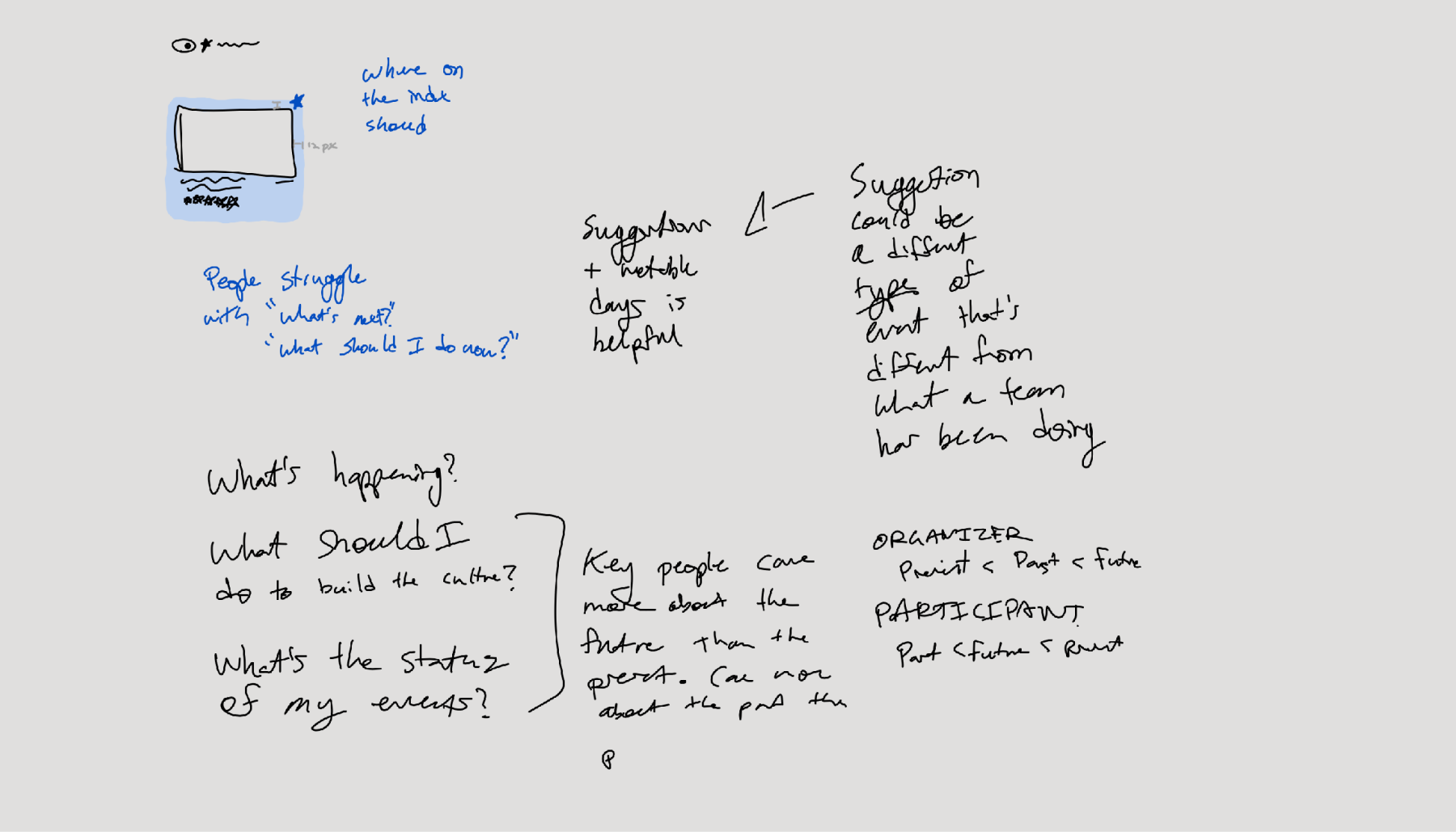
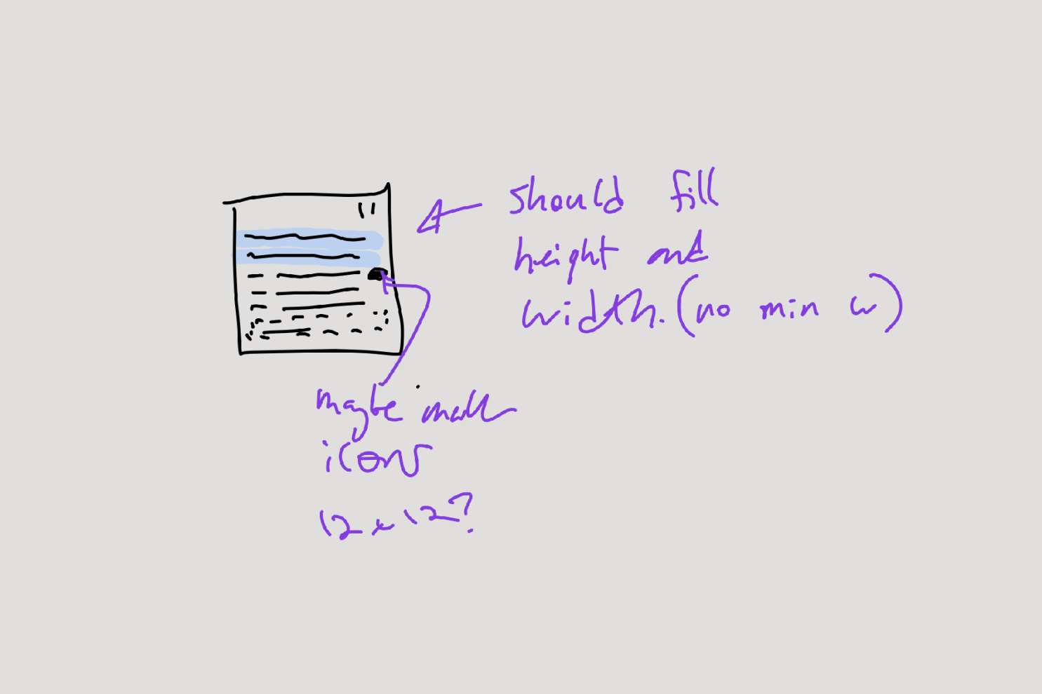
- Created distinct item styles and icon system.
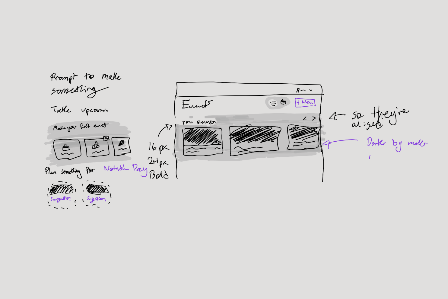
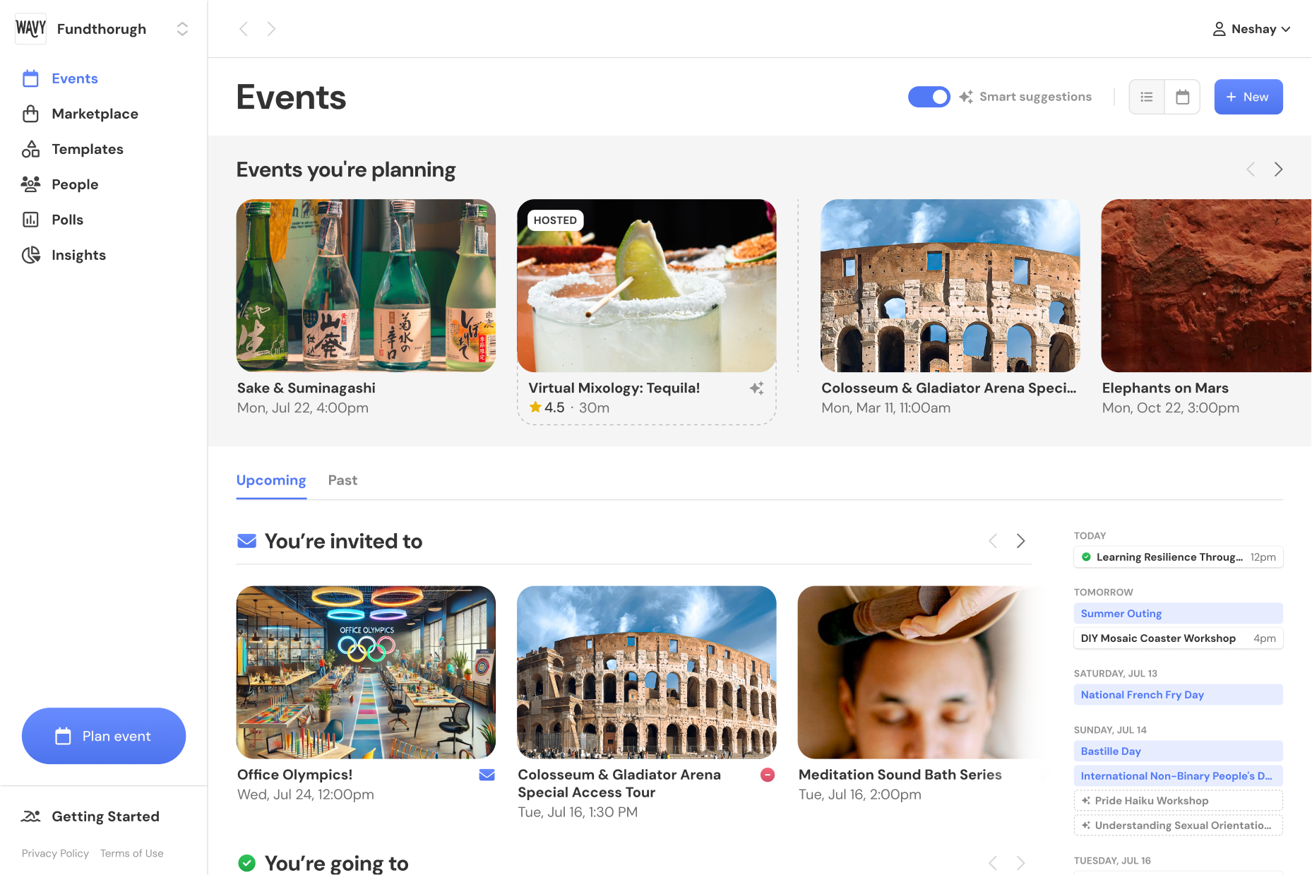
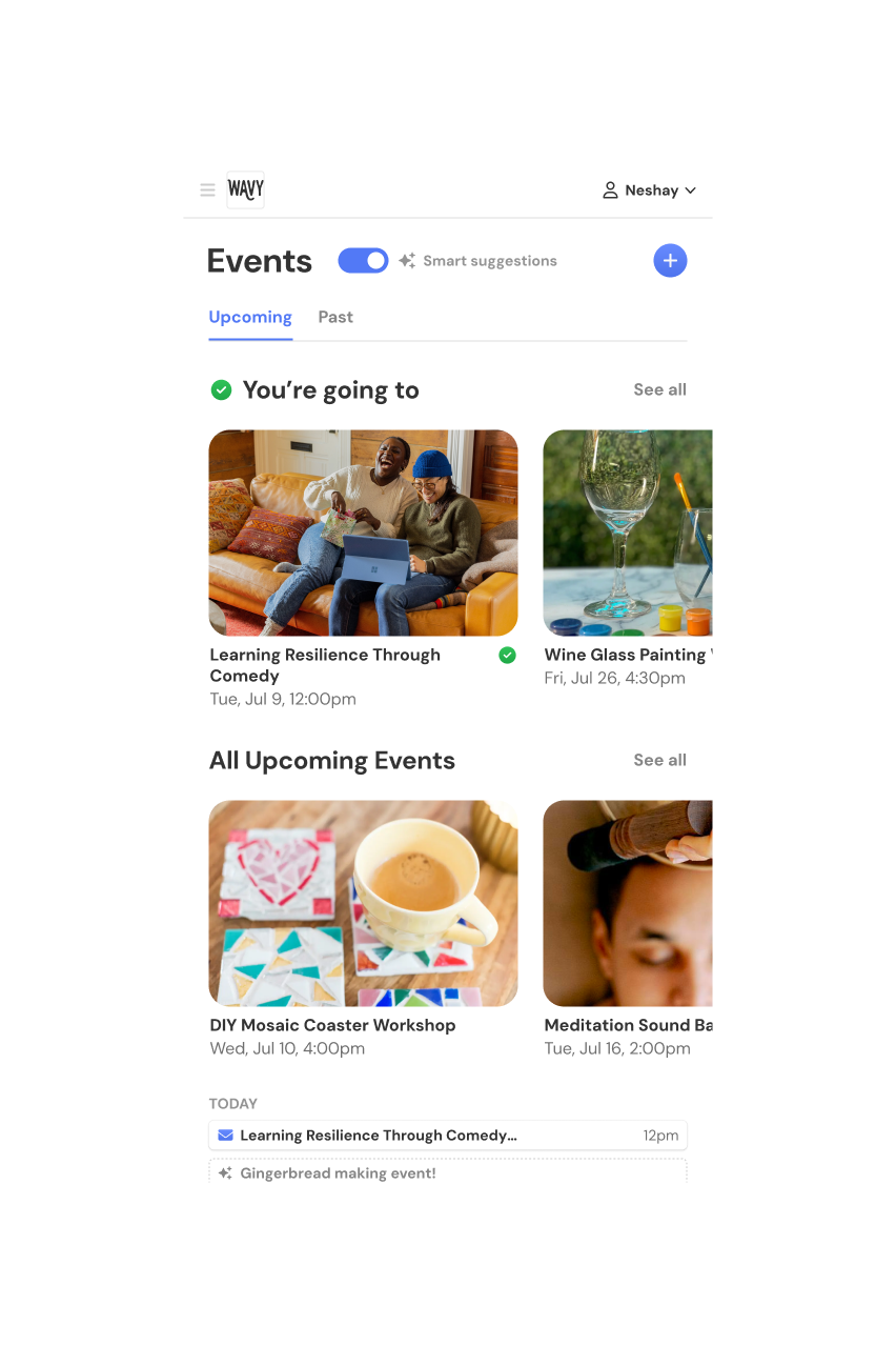
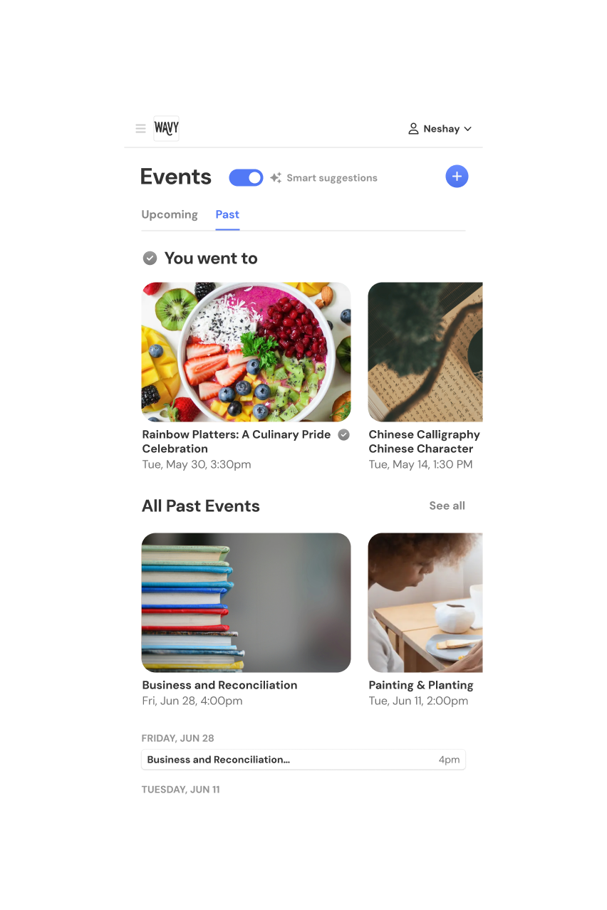
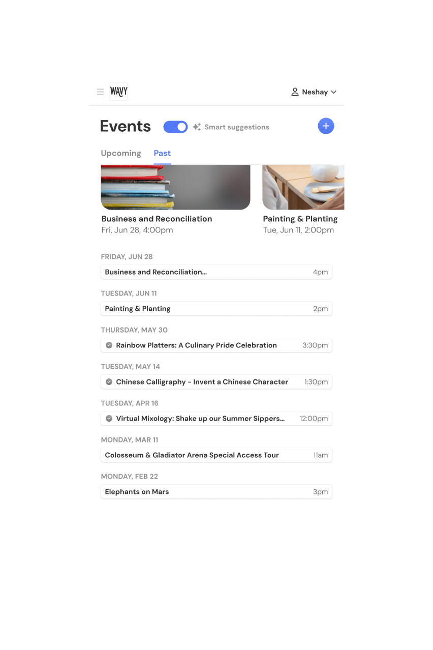
- Added a List View with Swimlanes and a Timeline.
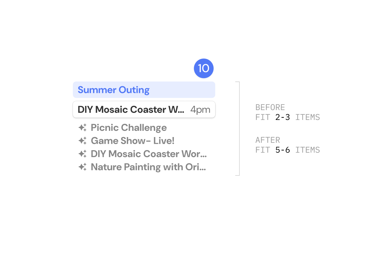
- Made calendar cells denser cells + updated themes.
3.1.00Unique Styling
3.2.00List View
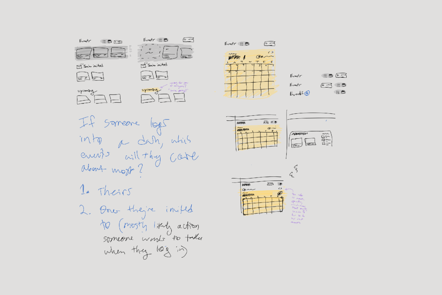
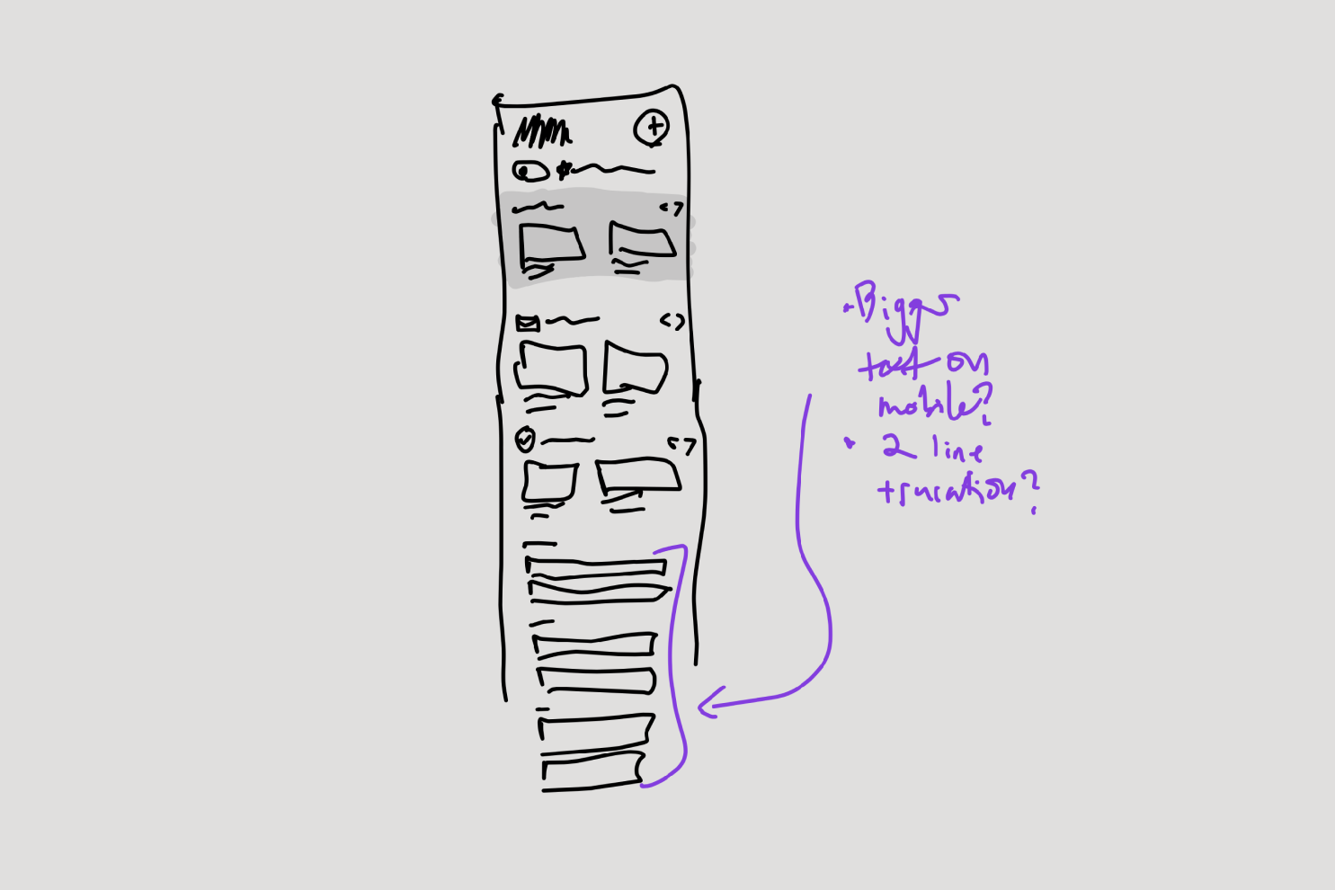
Research showed us that people thought about events in 3 different ways: Space (when’s everything happening), Category (where are x kind of events) and Chronology (what’s coming up). Since the calendar only afforded spatial reasoning, we added a List View to organize events in new ways.

